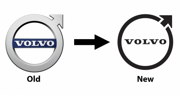
Volvo has introduced a new design for its famous Iron Mark logo, which appears to have been rolled out to all divisions of the Swedish carmaker, including here in Malaysia. Compared to the previous design, the new logo is a lot simpler with its monochrome style, although it continues to use the same font type as before.
Elsewhere, the centre bar that frames the script is now gone, while the ring is now slimmer and no longer sports a 3D effect. The all-important arrow pointing to the upper right gets the same treatment and results in the circle not being fully closed; fun fact: the circle with an arrow pointing out is an ancient symbol for iron.
Reports indicate that Volvo will continue to use the older, blue-accented logo on its vehicles through 2022, before all its cars make the switch to the new design from 2023 onwards. However, there doesn’t appear to be an official press release (yet) that talks about the new logo.
Volvo’s focus on simplicity when it comes to logo design is something we’ve seen before, as Volkswagen, BMW, Nissan and Renault have all made the switch to a flatter approach. What do you think of the new Iron Mark?
The post Volvo introduces new Iron Mark logo – simpler and flatter design; to be used on cars from 2023 onwards appeared first on Paul Tan's Automotive News.


0 Comments